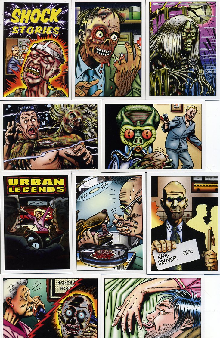
The Making of a Monster set!
By Kurt Kuersteiner ©2009 Monsterwax Monster Trading Cards for The Wrapper MagazineFor many moons, your editor (Les) has asked me to write an article about publishing cards. He wanted a "behind the scenes" look at the process from a manufacturer's standpoint. The project I wanted to discuss became the most ambitious series Monsterwax has ever made. The only problem was, the set took so long to complete, that over a decade passed before I could write about it! Fortunately, that series is finally finished, and the story of its creation is almost as strange as the horror tales it showcases! For starters, it morphed into two series: Shock Stories and Urban Legends. But let's begin at the beginning...
As regular Wrapper readers know, I'm a big fan of original art sets. Our first set was an art series devoted to old-time radio science fiction and horror shows called Tune In For Terror. Included in that set was a subset of eleven cards of original narratives. They were basically short, macabre stories that had twist endings. They were the most challenging part of the series to write, but they were also the most fun. Several customers asked if we would ever devote an entire series to those type of story cards. I was intrigued with the idea, but intimidated by the thought of having to come up with so many original plots. I started writing outlines to see how many good stories could be developed. The first few were easy, but it got progressively harder, because it's tough to force inspiration. I became beset with writer's block and eventually quit. I figured if the ideas popped into my head over time, fine, I'd write them down. Otherwise, it had become too frustrating.
Oddly enough, once I stopped trying to coerce new ideas, they started arriving on their own from an unexpected source: sleep. I started having vivid nightmares, ones with dramatic situations or unusual plots. Subconsciously, I must have been dwelling about the project, and when I dreamed, it influenced the subject matter. Whenever I had a really interesting dream, I would wake up to write it down. Actually, I wrote them all down, because when you're sleepy, you think everything is interesting or meaningful. Then you read what you wrote the following morning and often wonder, "WTF? This doesn't make any sense!" So most were not useable but I wrote them down anyway. (I eventually filled nine journals with various dreams and nightmares.) Over time, however, the really good ones built up in number until I knew there were plenty of strong plots to make a fascinating set.
Unfortunately, few people buy cards for the stories on the back. It's the images on the fronts that sell a set. So a top-notch artist would be required to make the project commercially viable. Tune in for Terror used several artists to speed up the process, but I wanted to use only one for the new project so that the style would be consistent. I started drawing thumbnail sketches of ideas and began searching for the right artist to draw the entire set.
I was living in Harrisburg PA at the time and played racquetball every week with Harris Toser (of Non-Sport Update magazine). I told him my desire to find someone who could draw dramatic images like the classic EC covers from Tales of the Crypt. Harris mentioned that Johnny Craig (one of the original EC artists) lived right across the river. I looked up Johnny's number and called him on the phone. He liked the Shock Stories idea, but he was unsure he had the time to finish it. (He was over 70, semi-retired, and drawing 50 different images was a big project.) I sent him some samples of the stories and sketches. He said he would look for an opening in his schedule while I finished writing the scripts and drawing the thumbnails.
I started to close in on completing the stories, but then I noticed the plots had a lot in common with urban legends, those spooky stories with surprise endings we all loved hearing at summer camp and childhood sleep-overs. No one had featured them in a card series before and I thought it would be neat to include them in the same box as the Shock Stories . It would double the size of the project from 50 to 100 cards, so I didn't dare mention it to Craig out of fear of scaring him off, but I started outlining those stories as well.
On September 13 th , 2001, two days after the terror attacks, Johnny Craig died. He was a wonderful man and a great artistic influence on comics. At first, I thought the card series should end with him, but then I realized that Craig himself wanted to see it published, so quitting wasn't really appropriate. I eventually resumed the search for another artist.
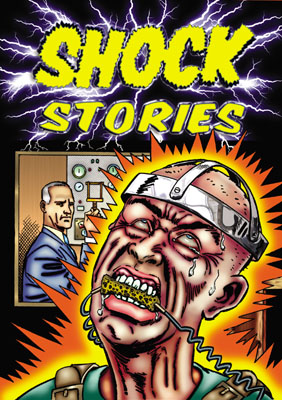
Luckily, I found Terry Beatty, who paints dramatic monster covers for Scary Monster Magazine, and also works on DC's Batman Strikes comics. He uses a very clean, naturalistic style similar to Craig, and he's a horror fan as well. I sent him samples of the stories and sketches, and he was enthusiastic about drawing them. He was swamped with other work, but he said if we could do them a bit at a time, he would eventually do them all, even the Urban Legends. Once I saw some of his finished pieces, I knew we had the right guy. His images are reminiscent of those 1950s pulp covers that reach out and grab your attention.
Terry drew the art the same way Johnny did for EC. He would illustrate and ink them, but leave the coloring for someone else. So we needed to find another artist who was really skilled with color. That guy was Paul Wolak. Paul is one of the best colorists I've ever seen, and loves to include all sorts of intricate details in his work. You can take a magnifying glass to his images and find all sorts of things hiding in the background. He's artistic in a variety of different mediums, including stain glass and drawing. I met Paul when buying my first set of Mars Attacks in The Wrapper years ago and we've been friends ever since. When he saw Terry's illustrations, he was blown away. He didn't have much spare time either, but he didn't want anyone else to touch them. He wanted to do it all himself.
The project picked up momentum. I would send a thumbnail sketch to Terry, he would email me the penciled sketch. I'd okay it, he would ink it, and I'd send that illustration to Paul, who would color it on computer using Photoshop. As the finished pieces started coming back, we saw we had something very special. Everyone who saw them was equally impressed. Todd Riley, also from The Wrapper, was a big help. He got his brother Jamie to design the back for us, then Todd printed a series of four Shock Stories promos. They turned out wonderful, but we decided to wait until the cards were close to release before distributing them (eight years later!)
We wanted to add some inserts to the series. Since it was homage to the 1950s horror scene, why not include a parallel set of 3-D cards with anaglyphic glasses to view them? Joe Riley (no relation to Todd or Jamie) offered to convert the Shock Stories illustrations into 3-D. Joe finished the first 18 but then he was pulled away on other projects. Van Beydler picked up where Joe left off and finished the remaining 33 images. (Van runs a 3-D website at www.3-Dreview.com and is a self professed 3-D fanatic!) The idea was to have all the base cards in stunning color, but also have a parallel set and provide a 3-D card in every pack. 3-D cards cannot use bright colors because they conflict with the 3-D process, so we needed another artist to completely redo the color of the 51 parallel cards. Kevin Graham stepped up to the plate for that, and he also designed the glasses and drew a special image for our staff "credits" card. (That's his head in the fridge!) We also used art by Joe Riley for the prize card (which we use to give away things like uncut sheets, $25 gift certificates, and original production art).
Over ten years had passed since work on the series began, but the final product was finally ready to print. We used a local printer so we could oversee the process to reduce errors and screw ups. We used the same folks to print the pop-up boxes and old style wax wrappers. The printers enjoyed working on the project, because they are usually stuck printing dull advertisements or boring bureaucratic forms. These were unlike anything else they had ever printed. I would go in there and find the employees reading the uncut sheets. You could say they were our very first fans!
The final series breakdown consists of two sets of 50 different base cards (100 total), two checklists, an embossed prize card, three "background" cards, two different sketch cards (one for each series), a metal card (an actual printing plate), an embossed master checklist, and the 51 card parallel series in 3D. There's also a free pair of the 3D glasses (of 3 possible designs) in every box. We normally limit everything to 500 boxes or less, but since it was two series in one box, we went with 1,000 numbered boxes (500 per series).
What I have outlined here is the production side of the process. However, there is another side that is just as important to the overall success of any product, and that's advertising. The Wrapper and Non Sport Update (NSU) are crucial advertising tools in the card market. If you don't get your cards promoted in either of those publications, you are basically wasting your money producing cards at all. The Wrapper deadline is just two weeks ahead of its mailing date, but NSU needs two months, and any special publicity (like articles or promo inserts) need to be scheduled even further in advance. Harris Toser helped design a full page color ad for the July issue of NSU, and we included three different Urban Legend promos in that same issue. These feature unique art and stories and are not found in the regular set. NSU felt the series was newsworthy enough to use it on their front cover, and they also wrote a good article about it. I contacted some non-card related magazines (like Illustrator and Scary Monster ) and worked with them to include coverage as well.
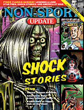
Aug/ Sept issue of NSU included (1 of 3) exclusive Urban Legends promos
Meanwhile, on the distribution front, I tracked down the card department for Diamond Distribution to see about having them carry the series. Diamond issues a catalog that is sent to every comic book store in America and is an excellent way to reach collectors outside the typical card channels. Unfortunately, those catalogs cost a lot to print and they are trying to lower expenses during the recession, so they are cutting back what they include. If they don't expect to sell thousands of dollars of the product, they won't waste their catalog space advertising it. Happily, they liked our series enough to include it. However, Diamond alone is not enough to reach the potential market, and very few places stock trading cards on the shelves or checkout counters anymore. Direct sales through the internet are vital, but using that option requires an easy to locate and navigate site to facilitate that task. We already set up Monsterwax.com during previous years of operation, but revamped it to make it more inviting and user friendly.
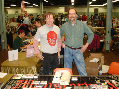
Another way to reach customers is to display the product at card shows. We opted to release the Shock Stories promos at the 50 th Philly convention and open a manufacture booth. Mike Fitzpatrick was very instrumental in not only helping arrange that but also in manning the booth. It was fun visiting with him and other collectors there.
Setting up at shows helps promote your product (At the 50th Philly with Mike Fitzpatrick on Right)
That, in a nutshell, is what it took to produce a new series of cards from start to finish. The printing cost for the cards, wrappers and boxes was around $10K, but that doesn't include the packing, advertising, or artist commissions (which are many thousands more). Most printers charge about $20K just to print and package a set. Photo sets can be designed and printed in just a few months, but lining up the proper team adds time if you don't have a regular staff or extra cash to hire contractors. If you're writing stories and creating new art from scratch, that will dramatically inflate the timeline as well.
Looking back at it now, it's obvious that it takes more than a good idea to make a good set--it takes good people. It's essential to find folks who have real talent and are willing to invest it in your goal. That means you either pay them a lot, or they share your enthusiasm to get the project done at any cost. Either way, it's a group effort and nobody makes a good series by themselves. So my personal thanks go to the entire team for making the card set of my dreams (literally!) Bringing this product to market has been a long and involved journey, but also a thrilling one. So if you think you're brave enough to view some really creepy comic cards, check out the finished product yourself. You'll be shocked!
All images © 2009 Monsterwax.com